Visualize Delicious Tags With Gephi
I’ve recently was playing around with a nice graph visualization utility called gephi. It allows to easily visualize large networks and graphs using a set of pre-defined layouts. It’s possible to import some existing graph into gephi using one of the formats it understands. I’ve decided to try to visualize tags of my Delicious bookmarks with it.
Let’s start with preparing CSV file with the list of edges (relations between tags):
This code produces CSV file containing the edges of relations graph. Each edge connects 2 different tags and has weight represented by the number of bookmarks which includes both tags. Example of output data:
It can be easily imported into gephi in Data Laboratory (using Import Spreadsheet button). Choose importing file type (edges in our case) and column to field associations. Make sure to check Create missing nodes checkbox because we’ve only prepared edges file.
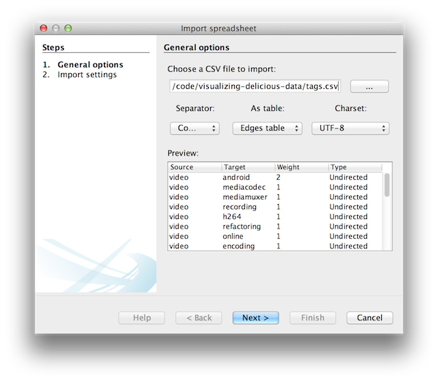
We should also fill-in Label column values for newly imported nodes so that we can put those labels to our visualisation. To do this automatically, let’s use handy Copy data to other column button and copy values from Id column to the Label column.
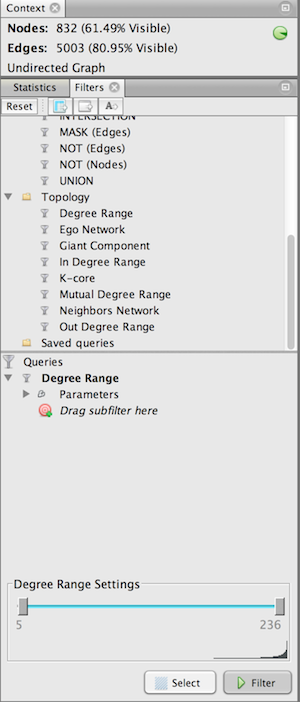
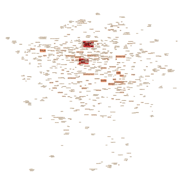
After successful importing we can proceed with visualisation. Let’s filter-out tags and edges with a low degree value by applying Degree Range filter. By doing this we’ll exclude all tags which are loosely connected with each other. It will make our visualization more representative. In the Overview pane select Filters tab in the right panel and drag Topology / Degree Range to the Queries area. Drag minimum range slider to the value of 5:
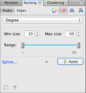
Let’s make node color and size dependable on it’s degree so that nodes with more connections are bigger and vice versa. It can be done in the Ranking tab at the left panel. Click on Nodes sub-tab and choose Degree for both Color and Size/Weight parameters:
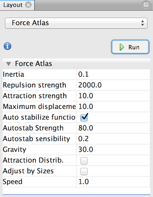
Finally, let’s apply Force Atlas layout to the graph. Set Repulsion strength to the value of 2000 so that tags are less closer to each other and don’t overlap. Click on Run and wait for a few seconds while layout is applying to the graph:
You can use Drag Tool to manually drag some nodes or clusters to improve appearance. Result can be viewed in the Preview pane. Let’s apply Tag Cloud preset to our graph: